What are the Crucial Aspects of a Business Website Design?
In the vast digital landscape, a business's website is like its online handshake, often the first meet-and-greet with potential customers. Creating a website that's not just eye-catching but also easy to use is a must. Let's break down the key ingredients that make a business website design in OKC, OK, tick.
The Basic Understanding of a Business Website Design
At the core of a successful business website design is making it easy for people to use. Especially for tablets and mobiles, it's not just about making things look good; it's about making the whole journey on the website feel like a breeze. So, it's not just pretty pictures; it's about smart designs that fit the small screens and keep visitors interested.
Top 3 Elements of a Business Website Design
Appearance: Imagine a website as a virtual store. The first thing people notice is how it looks. A good appearance draws people in, creating a connection in the digital world.
Layout: Think of web designers as architects. They organize information so that it makes sense and is easy to find. A thoughtful layout makes it simple for visitors to explore the digital space without getting lost.
Content: Communication is key. What's written on the website needs to be not just informative but also easy to understand. It's like having a chat with your visitors, building a bridge between the business and the audience.
The Responsive Aspect of a Business Website Design
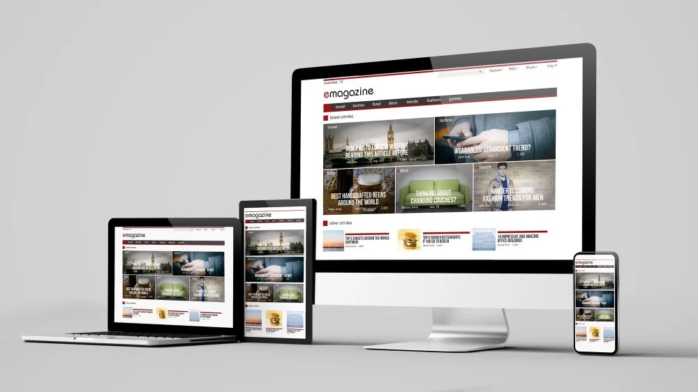
In a world where everyone uses different gadgets, a website must be flexible. That's where a responsive business website design becomes crucial. It's not just about fitting on different screens; it's about making everything look good, no matter what device someone is using. It's like having a website that's a good friend – always ready to adjust and look great.
What to Consider for a Responsive Design
Images and Fluid Grids: Using pictures and flexible grids ensures that things look good no matter the size of the screen.
Mobile-First Design: Start with making the business website design look great on phones. It's like building from the ground up, ensuring everyone gets a good experience.
Multiple Breakpoints: Think of breakpoints as the moments when the website adjusts its appearance. Having more of these ensures the website fits all screens.
Scalable Vector Graphics (SVG): These are like magic pictures that always look clear, no matter how big or small the screen is.
Accessibility and Minimalism: Making the website easy to use is like making friends with everyone. Keep the business website design simple, and everyone can enjoy the visit.
Understanding Adaptive Web Design
Responsive design is like a wardrobe that fits everyone. Adaptive design takes it a step further. It's like a wardrobe that not only fits but also changes its look based on what someone likes. It's a bit like magic – the same stuff but a different look for different people.
Web Accessibility Considerations You Must Know
Making a website that everyone can use is not just nice; it's necessary. It's like making sure your door is wide open for everyone. Here's how:
Color Contrast: Ensure that the words and backgrounds of the business website design stand out so that everyone can read and understand.
Consistent Layouts and Navigations: Keep things the same across the website so that visitors don't get confused. It's like having familiar road signs on a journey.
Identifiable Interactive Elements: Make sure buttons and clickable things are easy to spot. It's like making sure people know where to press for fun.
Clear Labels for Form Elements: Forms are like friendly questionnaires. Make sure the questions are clear so that everyone can answer easily.
Content Scalability: Imagine your website is like a superhero – it can change its size and still look awesome on any screen.
Visual Hierarchy: Think of headings as road signs. They guide visitors through the website, helping them find what they want.
Text and Media Alternatives: Some people like words, some like pictures. Make sure there's something for everyone while considering business website design.
Option to Pause Auto Playing Content: Imagine someone doesn't like surprises. Letting them pause autoplay is like giving them control, making their visit more enjoyable.
Creating a successful business website is not rocket science. It's about making things look good, work well and be friendly to everyone who stops by. So, by following these simple principles, you can have a business website design that not only turns heads but also satisfies visitors.
Skyrocket Your Business with High Five Media
Unlock the full potential of your online presence with our top-notch business website design in OKC, OK. High Five Media specializes in crafting digital masterpieces that turn visitors into customers. Ready to elevate your brand? Let's create a website that not only looks stunning but also drives real results. Reach out now, and let's make your mark in Oklahoma City!

